![]() CanViewer
CanViewer
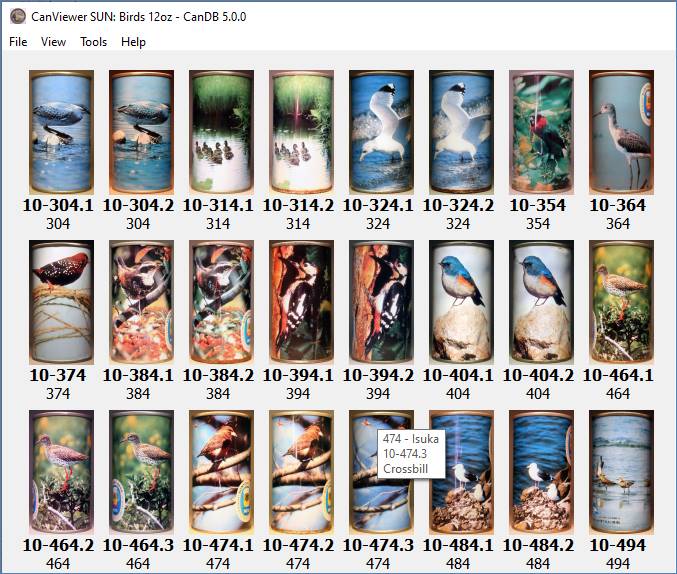
With the addition of basic search, I really needed to implement long overdue program option to view collection content. Something interacive, not viewing static HTML web pages. CanDB release 5.0 introduces the standalone CanViewer window. Complete collector control to define N columns, row pixel sizes, and numerous other options to produce format all collectors who have ever seen a USBC, BCU, Bible or Class book will immediately recognize.
The bottom of the CanViewer has “quick config” options of Columns, Row Height and Same Height. Please experiment, hit <Enter> and CanDB will change layout and resize images as requested. There are program defaults based on content being viewed such as Items, Brewery, Project, Search results, etc. and these can always be reset with the “Reset Config” button Use what you like, values saved persistent between program stop/restart.
Note: The values are saved persistent PER PROJECT. This means my CSS project with cans may have different persistent values than my SSS flat sheets project. There is also persistence for “Search” types.

Depending how you opened the CanViewer, the bottom button bar may have more buttons in the middle. In the above, this is from “View Items” for the currently selected Brewery. The “Prev Brewery” and “Next Brewery” are quick switch the viewer to the respective brewery’s items. If you opened with “Quick Search” you will have option to change the pattern.
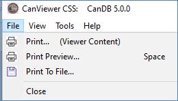
The CanViewer a standalone window. As such, has its own title, can be iconified, and has its own set of menus. Note the CanDB 5.0 options for Printing. You have taken the time to display exactly what you want, well you want an easy way to create a PNG/PDF to share with other collectors!
Optional Configration…
What, you want more configuration than just quick columns/row height? What about displaying with different spacing, no spacing, or most imporantly “I want to display some labels under each image”. Did you notice that blue hyperlink of “Optional Configuration”? Click and you get the optional, full configuration dialog as follows:
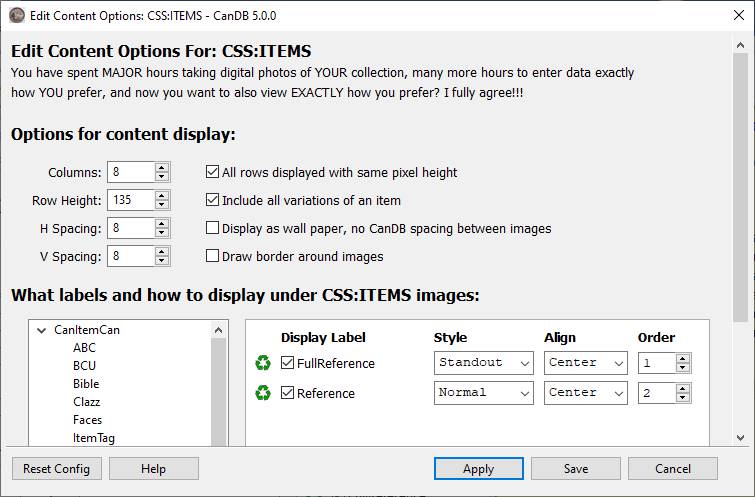
While this might look overwhelming at first glance, I believe any CanDB user will quickly understand and hopefully appreciate the full customiztion options. Lets break this configuration dialog down to its different sections.
Row/Column configuration
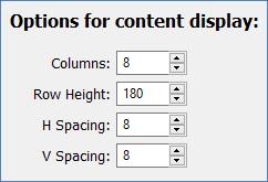 Integer
spinner controls for number of Columns and Row Height for each
image. By default the “Row Height” is ignored and just displays a given item’s
raw image size, faster than doing image scaling. However, if you really want
larger sizes, and honestly lots more fun, the “Same Height” option must
also be checked.
The final two spinner are integer number of horizontal and vertical pixel spacing between items. Eight pixels is reasonable default, but fully configurable.
Miscellaneous configuration
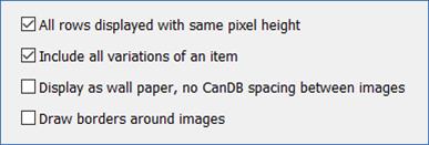 The next
section is a set of “check boxes” for different display features. The default
is to draw all images in raw, user captured pixel sizes. Use of the “Row
Height” and “Same Height” definitely produce more fun displays. If
the Row Height changes, the Same Height checkbox is automatically selected.
The other three check box options:
·
Variations – All items may have 0..N variations.
For a given item do you really want to see maybe five variations of the same
can face, all nearly identical but maybe a different canning company/code?
Well, sometimes YES, sometimes NO. You decide.
·
Wallpaper – I like collages, or images that would
be good computer wallpaper or screen savers. If this option is checked, CanDB
will ignore the Horizontal and Vertical pixel spacing between images and pack
as tight as possible. Note images may still have some spacing/padding, but this
will be due to your images not being 100% consistent. CanDB does NOT alter or
crop anyhing for display, would simply take too much delay in the drawing.
· Borders – The display is a table of N columns by R rows, all cells exactly the same size. Any extra wide cell will cause all the other cells to be same width. Displaying a simple border around the cell will give you a good idea why a given image or label is being drawn a certain way, e.g. where is the left, right, center and bounds of a cell.
And finally the “big boy”
Not knowing what labels to display, how many labels, what style or alignment, simply present to user with full control! While not “simple” to code, the new configuration options have created numerous display possibilities and hopefully will produce some cool collection snapshots to post on the Rusty Bunch forum or Facebook groups.
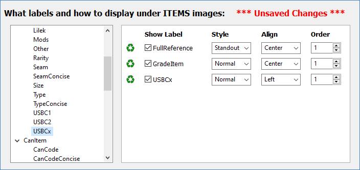
The tree on the left will present all possible display labels. For every Java class I have a set of getXYZ() getter methods for data access. I used a feature named “Java Reflection” to programmatically inspect all my Java classes such as CanProject, CanBrewery and CanItem. And for CanItem, the many sub-classes of CanItemCan, CanItemCoaster, CanItemTray, CanItemSheet etc based on what type of project you have created. Scroll over the tree, the label names should look very familiar, and correspond directly to data entry widgets on the different Item tabs.
The set of possible labels is dynamically generated from CanDB source code, and I have not attempted to document them all. Hopefully most are explanatory, if not, just give them a try. Here are some I anticipate used often:
|
Label Name |
Description |
|
FullReference |
Your assigned numbering of an item. For example, 60-124 |
|
ShortName |
Your assigned Short Name. This is likely too verbose for CanViewer display, but I expect this will be used frequently for Search |
|
ShortWord |
Just the first “word” of Short Name. Sometimes useful for CanViewer labels |
|
USBCx |
There are two references, USBC 1 (flats/cones) and USBC 2 (tabs). A given item may have none, one, or both assigned values. USBCx first looks for USBC 1, and then USBC 2 |
|
xxxConcise |
Labels such as CanCode and CanCompany are fine verbose when displayed on the Item tab, but often a bit too long for CanViewer display. The xxxConcise labels are an attempt to “squeeze” the same info into a shorter, concise string for CanViewer display. |
Mouse click on a given tree label to add it to possible considered label rows for display. Click on the green “recycle” icon to remove it from consideration. Basically adds a possible label to the right as “yes, I might want that”, recycle removes it as “nope, won’t need it”. There will be one row in the right “table” for each possible display label, with the label name having a checkbox in front. Even though you might want the above three labels, just quick click checked/unchecked will include/exclude it in the displayed output. When time to draw the CanViewer content, only user labels in the right set and “checked as wanted” will be drawn. May be zero labels, I think max label rows is 25.
Notice the “*** Unsaved Changes ***”. Anytime you change any value, the window will inform you something has changed but not yet written persistent to properties file. Doing an Apply or Save will write persistent to local disk, as well as triggers automatic Refresh of the CanViewer display. Easy to dynamically change your personal book…
Style
The three Style controls for a given label hopefully make sense. As with everything in CanDB, all GUI display is fully user configurable, bigger fonts, different colors, all grouped under “Tools -> Preferences” groups. Within each user preference group, there is a default CanDB configuration for the different label styles.
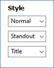
Normal: Default for most labels, common font size/look
Standout: This is usually same font size as Normal, but in Bold style
Title: Normally both larger font size and Bold
Alignment
Anyone using any type of document editor, e.g. Microsoft Word, will recognize ability to control the alignment of characters
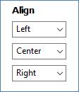
Left: Label will be Left justified horizontally
Center: Label will be Centered horizonally
Right: Label will be Right justified horizontally
Order
This configuration is “relative ordering” of labels under a given item.

Simply a way to control that label “A” should display above label “B”. When time to display, CanDB grabs list of “checked wanted” labels and sorts them based on relative order. No error checking, if you have two labels with the same ordering, the rows might not display how you like. Just change orders. When you Apply/Save, the possible checked labels are sorted by their “Order” setting.
As with everything CanDB and BMV, the GUI keeps persistence, so future window open or program stop/restart, it will remember your previously used values. There is a “Reset Config” that will reset the “Options for content display” to CanDB defaults but the User Label configuration is never touched. You clicked it, you can unclick it if no longer want it.
PLEASE EXPERIMENT – There is nothing you can break. You don’t like a display format, label, alignment or style, just a few clicks to undo. You don’t want any labels displayed, uncheck all boxes in from the label name, or use the recycle icon to just remove.
Bottom line, use whatever formatting YOU prefer, and please share some cool screenshots or printed PNG of your collection filtered or searched with CanDB, to the Rusty Bunch forum or Facebook groups. To make this sharing even easier, there are now printing menu items to save to PNG(s) or PDF, and worst case if you must, paper printer.
Tools -> Preferences
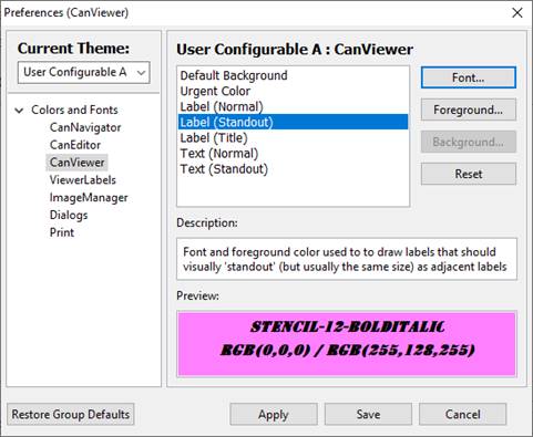
If the above are not enough options to get display exactly like you want, remember there is the “Tools -> Preferences” dialog. CanDB 5.0 introduces a “CanViewer” preferences group that controls how labels are displayed in the CanViewer window. From here, you just select the “CanViewer” group, you have full contol over the window’s background color, and full control of the font family (e.g. Courier, Times New Roman, Arial), font pixel height, and font style (e.g. Italic, Underline, Bold) for the three label styles of “Normal”, “Standout” and “Title”.
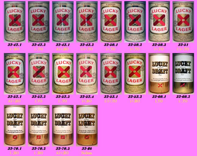
The following is an example where I mucked with Default Background, and Label (Standout), Label (Title) and Label (Normal). The results are horrific, but clealy demonstrates possibilities. To each their own, I have since used the bottom left “Restore Group Defaults” button to remove this hideous configuration example.
